EPA creates water quality map of farm-related pressure areas

The Environmental Protection Agency (EPA) has developed a map which highlights how water quality is affected by farming activity in different areas of the country.
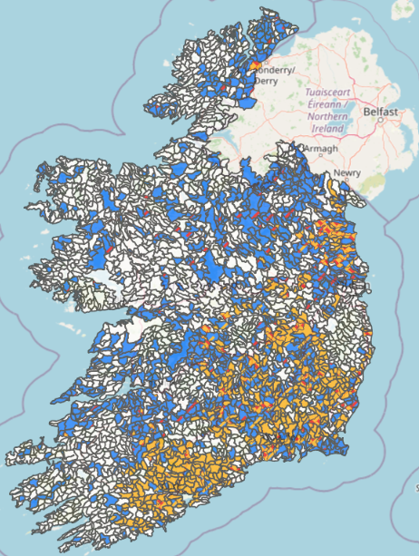
The map, which was published this month, is divided into sub-basins, which are colour-coded to highlight different issues related to farming activity.
A single sub-basin may be colour-coded with different colours, meaning there is more than one issue in that area.
The map is available through the EPA Geoportal website, under water maps. The map is interactive, allowing users to zoom in and get a clearer picture of issues arising in their area.
According to the EPA, the purpose of the map is to highlight areas where measures from the agricultural sector are needed to restore water quality.
The colour-coding system, referred to as coloured flags, has been developed to support targeting agricultural measures to "get the right measure in the right place".
The data on which the map is based comes from "key national datasets", the EPA said.
Flags are assigned to each sub-basin to indicate the potential water quality issues to focus on.
Where agricultural measures are needed to restore water quality, one or more coloured flags indicate the type of water quality issues associated with that sub-basin.
The meanings of the flags are as follows:
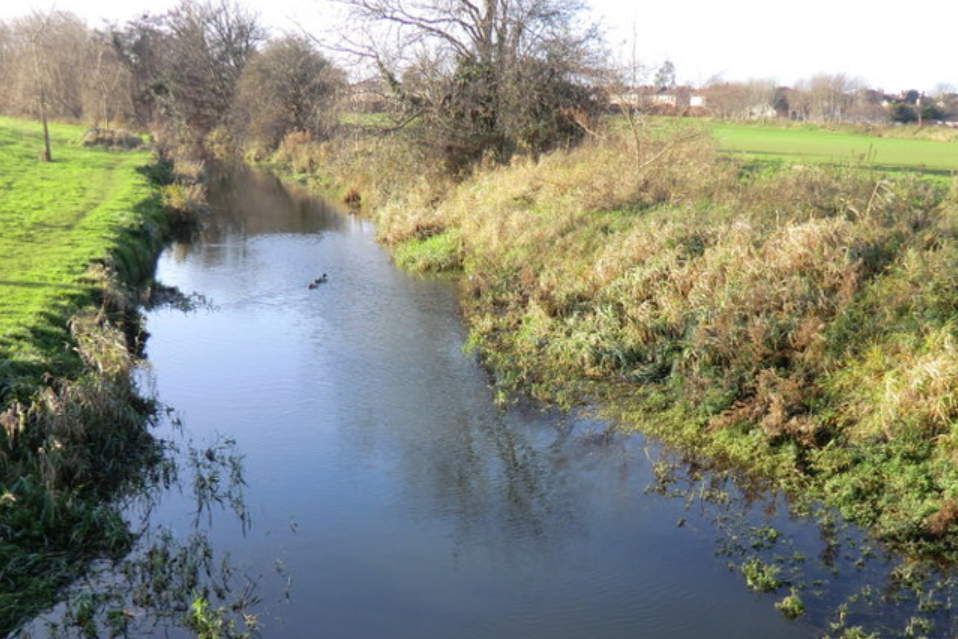
- Red - a potential point source of water quality pressure (this refers to a specific source of pollution, which in an agricultural context could refer to a farmyard);
- Orange - nitrate losses to water bodies or courses;
- Blue - phosphorous or sediment losses to water bodies or courses;
- White - agriculture is not identified as a significant pressure on water quality, and measures to protect water quality are currently appropriate.
The EPA says that these flags indicate potential impacts arising from agriculture to facilitate targeting actions and should be combined with local knowledge and evidence.
The overall map and the flags for each sub-basin will be reviewed annually.